For Intro to Graphic Design, I created a personal logotype based on my name as part of a larger resume project. The objective was to design a strong visual identity that represents both my professional goals and personal creativity throught the use of Adobe Indesgin.
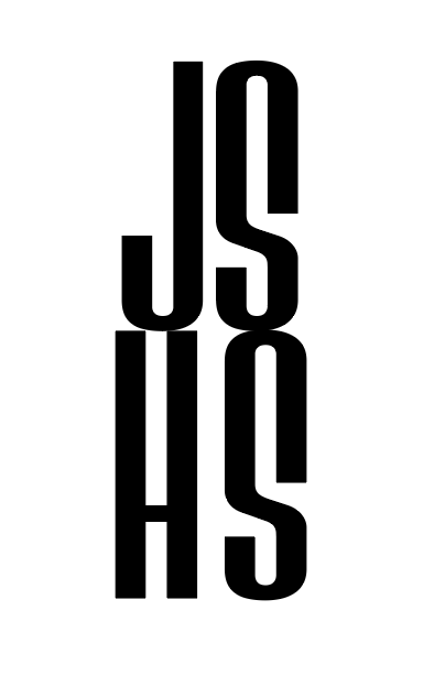
When creating my logotype, I wanted to incorporate my full last name while balancing all four initials in a way that felt clean and intentional. To achieve this, I arranged the letters into an even square, creating a balanced monogram where each letter holds equal visual weight. I chose a bold, heavy typeface to reflect a strong personality and add impact. The final layout also created a maze-like illusion, which made the design feel more dynamic and memorable. Careful attention to kerning and sizing was essential to maintain readability and balance.